rustdoc: simplify CSS and DOM for more-scraped-examples

This gets rid of the more-scraped-examples-inner wrapper, instead nesting the children directly and using absolute positioning for the toggle line.
Added along with theme picker changes in
e78f1392b7, but no reason seems to have been
given at the time for why this particular rule was added.

Removing this rule results in `<kbd>` elements getting an I-bar, while the
rule causes them to use the "default" arrow, but since selecting the text in
these elements works fine, the I-bar is not misleading.
* They all get rounded corners now. A test case has been added for this, too.

* There are now broadly two kinds of stability badge, where there used to be
  three: item-info "fat badge", and the "thin badge" in both item tables and
  in docblocks (which got merged). The fat badges can have icons, while the
  thin badges can't.
Improve Rustdoc scrape-examples UI
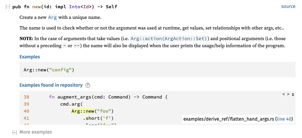
This PR combines a few different improvements to the scrape-examples UI. See a live demo here: https://willcrichton.net/misc/scrape-examples/small-first-example/clap/struct.Arg.html
### 1. The first scraped example now takes up significantly less screen height.
Inserting the first scraped example takes up a lot of vertical screen space. I don't want this addition to overwhelm users, so I decided to reduce the height of the initial example in two ways: (A) the default un-expanded height is reduced from 240px (10 LOC) to 120px (5 LOC), and (B) the link to the example is now positioned *over* the example instead of *atop* the example (only on desktop though, not mobile). The changes to `scrape-examples.js` and `rustdoc.css` implement this fix.
Here is what an example docblock now looks like:
### 2. Expanding all docblocks will not expand "More examples".
The "More examples blocks" are huge, so fully expanding everything on the page would take up too much vertical space. The changes to `main.js` implement this fix. This is tested in `scrape-examples-toggle.goml`.
### 3. Examples from binary crates are sorted higher than examples from library crates.
Code that is written as an example of an API is probably better for learning than code that happens to use an API, but isn't intended for pedagogic purposes. Unfortunately Rustc doesn't know whether a particular crate comes from an example target (only Cargo knows this). But we can at least create a proxy that prefers examples from binary crates over library crates, which we know from `--crate-type`.
This change is implemented by adding a new field `bin_crate` in `Options` (see `config.rs`). An `is_bin` field has been added to the scraped examples metadata (see `scrape_examples.rs`). Then the example sorting metric uses `is_bin` as the first entry of a lexicographic sort on `(is_bin, example_size, display_name)` (see `render/mod.rs`).
Note that in the future we can consider adding another flag like `--scrape-examples-cargo-target` that would pass target information from Cargo into the example metadata. But I'm proposing a less intrusive change for now.
### 4. The scrape-examples help page has been updated to reflect the latest Cargo interface.
See `scrape-examples-help.md`.
r? `@notriddle`
P.S. once this PR and rust-lang/cargo#11450 are merged, then I think the scrape-examples feature is officially ready for deployment on docs.rs!
Fix UI issues with Rustdoc scrape-examples feature.

A few regressions have been introduced into scrape-examples in the last few months. This commit fixes those regressions:
* Help file was being loaded from the wrong place (introduced in f9e1f6ffdf).
* CSS selector in JS has a typo (introduced in 14897180ae).
* Line numbers in scraped example code snippets are overflowing (not sure if this was ever fixed). Changing from flexbox to grid display fixed this issue.
It's not obvious why this was ever a separate class name, since even
in c4219a4783 when it was first added,
it was styled identically to regular `fn` links.
This commit fixes a few inconsistencies and erratic behavior from the
notable traits, settings, and sidebar popups:

* It makes it so that pressing Escape closes the mobile sidebar.
  This is a bit difficult to do on iPhone, but on other setups like
  desktop tiling window managers, it's easy and makes sense.
* It makes sure that pressing escape while a notable trait popover is
  open focuses the popover's toggle button, instead of leaving nothing
  focused, since that makes more sense with keyboard navigation. Clicking
  the settings, help, or sidebar buttons, however, will not focus the
  notable trait popover toggle button.
* It ensures that notable trait and settings popovers are exclusive
  with the mobile sidebar. Nothing should ever overlap a popover, and
  there should never be more than one popover open at once.
rustdoc: simplify `.search-results-title` CSS

By using `display: flex`, we still get the never-wrapping layout with `#crate-search-div` maxing out and truncating its text. The title itself winds up always filling its parent, but since `#crate-search` doesn't have `flex-grow` set, it won't fill available space.
By using `display: flex`, we still get the never-wrapping layout with
`#crate-search-div` maxing out and truncating its text. The title itself
winds up always filling its parent, but since `#crate-search` doesn't have
`flex-grow` set, it won't fill available space.